Leisure • Art/Architecture
The Secret of Beauty: Order and Complexity
This is an essay about beauty – and in particular about what makes something beautiful. We want to give you the answer right away:
BEAUTY = ORDER and COMPLEXITY
In other words, a thing is beautiful when it’s at an ideal midway point between being very ordered and very complex.
Let’s start with order – and let’s do so by looking – as we will throughout this essay – at the example of architecture.
Order can be very nice to look at. Here is the front facade of the Palace of Versailles:

But when we have too much of order, things quickly become boring. Many parts of our modern cities are very boring to look at.


There’s nothing charming or exciting or lovely here. The best thing that could happen is that you stop noticing the buildings. It seems that we want things to be ordered, but not too ordered…
At the other end of the spectrum, there’s something else that can go wrong: too much chaos. Modern cities and buildings can look very messy and chaotic.


Totally different kinds of buildings may be jumbled together; or there’s so much advertising you can hardly see the buildings (which aren’t very nice anyway); or huge, complicated roads just seem to plough their way through the city.
It’s very helpful to think about why we don’t like either boring or chaotic places. It’s to do with how our brains work. Our brains are all the time searching to find patterns in things and to make sense of what’s going on around us. If something is very, very simple our brains find the pattern immediately and we lose interest. It’s dull and tedious. That’s why hardly anyone in the world would find the rubber bath-mat fascinating to look at.

But if the pattern is too difficult to see – or if there’s no pattern at all – our brains get frustrated and annoyed.

We dislike chaos because when there isn’t enough order and regularity we can’t work out what’s going on. We feel lost and confused.
But there’s an ideal midway-point between the extreme of too little order and the opposite extreme of too much order.
TOO LITTLE ORDER <———-> MID-POINT <———-> TOO MUCH ORDER
(CHAOS) <———-> (INTERESTING) <———-> (BORING)
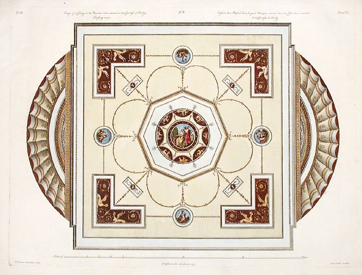
Something around the mid-point might look like this:

At first the pattern looks obvious: there’s a square with a curve at each side. But the more you look at it the more complicated the pattern gets. But even though it’s complicated, each complicated bit turns out to be very ordered. Our brains are moving all the time between finding a pattern, then feeling a bit confused, then finding more pattern. So your brain doesn’t get bored, but it doesn’t get very confused either. This is interesting. In the same way a story or a game is interesting when it’s complicated enough for your brain to keep on trying to work out what’s happening, but it’s ordered enough, so you feel you can make sense of it. It’s not too complicated but it’s not too simple either.
Our brains react in the same way to architecture. Here’s an example of interesting architecture – a row of houses in Telc, a small town in the Czech Republic in Central Europe. The houses were all built a long time ago, in the 1600s.

In some ways all the houses in this row are pretty similar. They’ve almost all got: three arches at the bottom, then three rectangular windows directly above the arches, then one window in the middle at the top level. The top of each building is quite fancy – it’s curved or stepped or pointed. So there’s a background of similarity – but each house is actually quite individual: it’s a different colour; some are highly decorated while others are more plain.
Our brains keep on spotting patterns, but the patterns aren’t simple; we keep on seeing variations, but the variations make sense. The more you look the more it feels quite ordered and quite complicated at the same time.
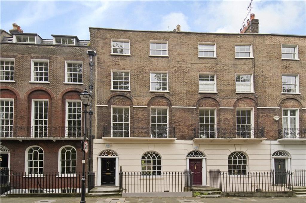
You can use the same idea to talk about this street in London built in the 19th Century.

There’s a lot of order, but there are lots of little variations. The house on the left is a bit lower than the houses on the right – but it has the same basic structure: it’s related but not quite the same. In all these houses, on the top three floors, each window sit directly above the one below – but not on the ground floor, where the windows and doors have a different pattern. The windows at the bottom are arched, and those above have square tops. But then there’s a special little trick the architect has used. The windows on the first floor up have brick arches above them – which are a little bit like the arched tops of the windows below.
It takes ages to explain all this in words (sorry!) but our eyes take it in very quickly. We see that these houses follow a definite pattern but we also see that it’s a complicated pattern.
Some very good modern architects have used the same idea – but in new ways. Here’s a row of houses that were built next to the water on a place called Java Island, which is part of the city of Amsterdam.

Overall there’s quite a strict pattern. Each house is the same height and width. And the colour range is restricted to white, grey and various shades of red and brown. And you are not allowed to use any curves. But within this basic pattern, each house is completely individual. The windows are different shapes and sizes, the materials change a lot, some have brick, others are mainly glass; some houses have balconies, others don’t. They’re similar, but different.
We know that lovely cities and buildings are interesting to look at. But now we understand something more of the recipe for loveliness; we’ve got an idea of how you make interesting architecture going forward, rather than simply appreciating it in the past. You have to have a strong, simple pattern with plenty of variation in the details. You need order and complexity. That will be one infallible route to beauty.


